ARIA Overload: The ARIA Paradox: Good Intentions, Terrible Execution
By The bee2.io Engineering Team at bee2.io LLC
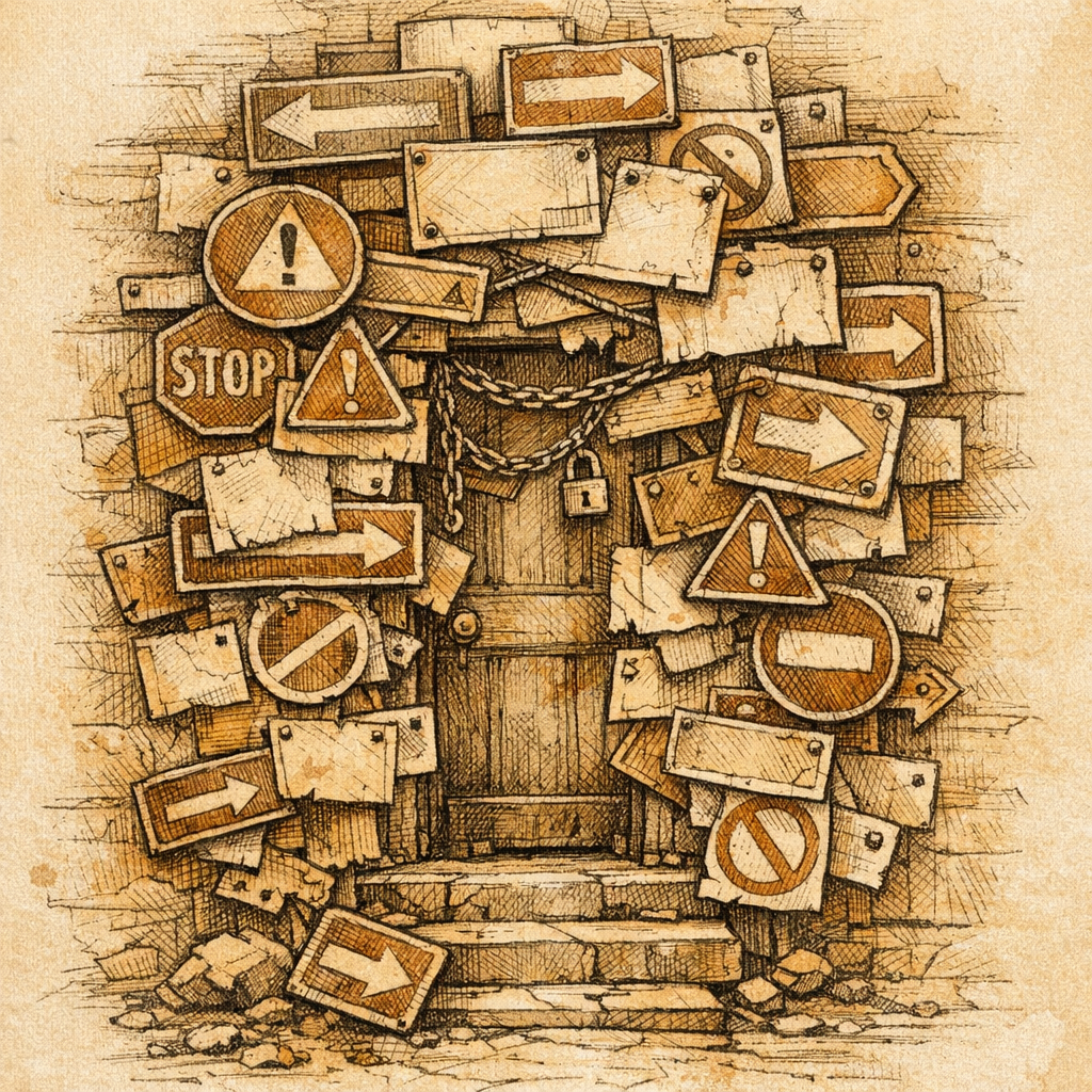
You know that feeling when someone tries to help you find something but they're so eager about it that they end up pointing at literally everything? That's your website right now if you're slapping ARIA attributes on elements like they're going out of style.
Here's the uncomfortable truth nobody wants to say at the accessibility conference: most developers use ARIA wrong, and we're out here creating a worse experience while patting ourselves on the back for being inclusive. It's like serving someone a gourmet meal while also screaming a detailed ingredient list directly into their ear the entire time.
According to accessibility research, roughly 60% of ARIA implementations on the web are either unnecessary or actively harmful. Let that sink in. We're not just being redundant - we're making things worse while trying to help.
The ARIA Paradox: Good Intentions, Terrible Execution
ARIA stands for Accessible Rich Internet Applications, which is a fancy way of saying "band-aid for when you've built something too complicated." The spec exists for a reason - modern web apps are weird and wonderful, and sometimes you need extra guidance for assistive technologies.
But here's where developers lose the plot: they treat ARIA like seasoning and decide that if a little helps, drowning your entire website in it must be amazing. Spoiler alert: it's not. It's the equivalent of making a beautiful salad and then pouring an entire bottle of hot sauce on it because hot sauce is good.
The golden rule - and read this slowly so it sticks - is that if native HTML elements do the job, use them and stop there. A button is a button. A link is a link. A heading is a heading. You don't need to bolt ARIA onto these things like they're incomplete. They already work.
When you add unnecessary ARIA to native elements, you're essentially creating conflicting instructions for screen readers. Imagine giving someone directions while they're already holding a perfectly good map. "Turn left... no wait, actually also turn left according to my thing... but the sign says left..." It's maddening.
The Redundancy Trap: When You're Saying the Same Thing Twice
One of the most common sins we see is slapping role="button" on actual button elements. A real button already tells screen readers it's a button. Adding role="button" doesn't enhance this - it's like labeling a door that already says "DOOR" with another label that says "DOOR." Your users aren't confused; they're now just hearing "DOOR" twice and wondering if you're broken.
The same goes for adding aria-label to elements that already have perfectly clear text content. Or using aria-hidden="true" on decorative elements that are already properly marked up. These are the digital equivalent of telling someone to ignore something while also loudly announcing it.
- Native
<button>elements are already accessible - don't reinvent them <h1>, <h2>, <h3>tags are already semantic - ARIA can't improve this- Proper
<form>structure with<label>elements beats ARIA label chaos - A real
<nav>element needs no role="navigation" backup
What makes this infuriating is that developers often add this stuff thinking they're being extra careful. They're not. They're being redundant, and redundancy breeds confusion faster than bunnies breed bunnies.
The Real Cost: Performance, Maintenance, and User Sanity
Beyond the conceptual mess, excessive ARIA creates actual problems:
- Screen reader bloat: Every unnecessary ARIA announcement clutters the user's experience. They're trying to navigate, not listen to your life story.
- Maintenance nightmare: More ARIA means more things to keep in sync when your content changes. Forgotten aria-labels become lying aria-labels real quick.
- False confidence: Developers think they've solved accessibility and stop actually testing with real users or assistive technology.
- Browser confusion: Conflicting ARIA instructions can actually break accessibility features that work fine on their own.
It's the web development equivalent of over-engineering a solution to a problem you could have avoided by just reading the instructions on the box.
How to Actually Fix This
Start by getting brutally honest about your ARIA usage. Ask yourself: "Does this native element already do this?" If yes, delete your ARIA and move on with your life.
The accessibility hierarchy is simple:
- Use semantic HTML (buttons, forms, headings, nav, etc.)
- Use ARIA only when semantic HTML can't do what you need
- Test with actual users and assistive tech, not just a checklist
- Remove anything that doesn't pass the "does this actually help" test
Before you launch your next feature or redesign, run your site through SCOUTb2 and look specifically for ARIA conflicts and redundancy. Look for places where you're saying the same thing twice. Be ruthless about it.
Your users - all of them, not just those using assistive technology - will thank you for a cleaner, simpler, less noisy website. That's not just good accessibility. That's good design.
Disclaimer: This article is for informational purposes only and does not constitute legal, professional, or compliance advice. SCOUTb2 is an automated scanning tool that helps identify common issues but does not guarantee full compliance with any standard or regulation.
Stop finding issues manually
SCOUTb2 scans your entire site for accessibility, performance, and SEO problems automatically.