Your Heading Hierarchy Is a Choose-Your-Own-Adventure Novel (And Not in a Fun Way)
By The bee2.io Engineering Team at bee2.io LLC
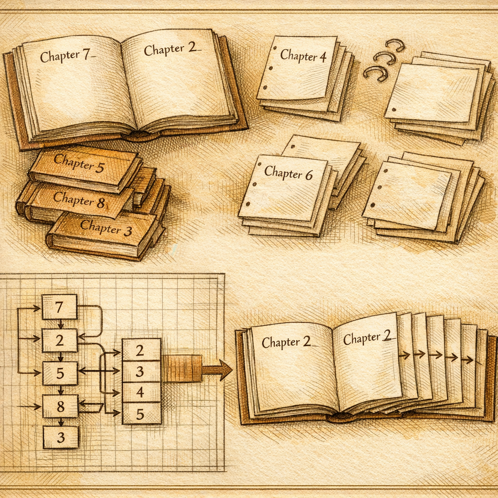
Imagine someone hands you a book with no table of contents, random chapter numbers, and three chapters labeled "Chapter 5." That's your website to someone using a screen reader right now. Congratulations, you've accidentally created the most frustrating reading experience since your college textbook assigned chapters out of order.
Here's the thing: screen reader users don't scroll through your site like the rest of us. They navigate by headings-headings act as their table of contents, their GPS, their everything. When your heading hierarchy looks like it was designed by someone who learned HTML from a fever dream, you're not just being inaccessible. You're actively hostile to an entire group of people trying to use your product. Which is, objectively, a vibe.
The Heading Hierarchy Disaster: Why Your H1 Is Lonely and Your H3s Are Confused
Let's talk about what's probably happening on your site right now. Published research consistently shows that roughly 60-70% of websites have malformed heading structures. That's not a typo. Most of you are doing this wrong, and the thing is, you probably don't even know it.
The typical crimes we see: missing H1 tags (your page opens with an H2, like you're walking into a movie theater and skipping the trailers to start in act two). Skipped heading levels (H1, then H3, skipping H2 entirely-it's like climbing a ladder with missing rungs). Decorative headings that serve zero purpose except to make your designer feel fancy. Multiple H1s per page, because apparently we learned nothing from the early 2000s.
Here's where it gets deliciously ironic: your design team probably spent hours perfecting those headings visually. They look great! But to a screen reader, they're just noise. The hierarchy is nonsensical. You've essentially decorated a house beautifully while leaving the architectural blueprints completely broken.
Design Systems to the Rescue (Finally, Something You Can Actually Fix)
This is where the magic happens, and it's less "magic" and more "basic competence applied consistently." The solution isn't going through each page manually (which is how you end up crying into your keyboard at 11 PM). The solution is fixing this at the design system level.
When you bake accessible heading components into your design system-when you create standardized heading tokens with predefined hierarchy, semantic meaning, and visual styling all locked together-something beautiful happens: every product surface improves simultaneously. Your marketing site, your dashboard, your documentation, that weird internal tool nobody maintains. They all get fixed at once.
- Create heading components that enforce hierarchy. Your component library should make it literally impossible to skip levels. An H2 component only works inside content that has an H1. No exceptions, no workarounds.
- Separate visual styling from semantic structure. If your designer wants an H3 to look like a big bold title, that's fine-but it still needs to live in the correct hierarchy. Use CSS to make it look however you want. The HTML stays truthful.
- Document the purpose of each heading level. H1 is the page title. H2 is major section. H3 is subsection. H4 is sub-subsection. Write it down. Share it. Make it impossible to forget. (Seriously, most teams just wing it and hope nobody notices.)
- Build heading tokens that cascade across products. If your design system says "all H2s use this font size, weight, and spacing," then every product using that design system gets consistent, accessible headings by default.
The beautiful part? You're not adding complexity. You're removing it. You're taking a mess of contradictory decisions and replacing it with one shared, tested, correct system. Your developers stop arguing about heading levels. Your designers stop making weird visual exceptions. Everyone gets to do their job better.
The Screen Reader User Perspective (They're Probably Giving Up Right Now)
When a screen reader user lands on your site, they typically jump directly to the headings to understand the page structure. They're not reading every word-they're scanning. They're looking for a roadmap.
Right now, if your heading structure is broken, that roadmap looks like a map of Middle Earth drawn by someone who's never seen a map. They can't find what they need. They get frustrated. They leave. You lose users, traffic, and potential customers-all because your H tags are a disaster.
Industry data suggests that 15-20% of your potential users may rely on assistive technology at some point. That's not a niche. That's a significant portion of your audience you're actively excluding.
What You Do Now
Audit your design system documentation. Do you have a heading hierarchy guide? If not, write one. If you do, does it get followed consistently? Probably not. Start with your most-used product surface and fix the heading structure there, using semantic HTML and your design system components. Then cascade that fix across everything else you own.
Use a scanner tool-like SCOUTb2-to identify heading structure problems across your entire product suite. See the pattern. Fix it systematically at the component level, not page by page.
Your screen reader users will thank you. Your design system will thank you. Your future self-the one who doesn't have to manually fix 47 heading hierarchy issues in three months-will definitely thank you.
Disclaimer: This article is for informational purposes only and does not constitute legal, professional, or compliance advice. SCOUTb2 is an automated scanning tool that helps identify common issues but does not guarantee full compliance with any standard or regulation.
Stop finding issues manually
SCOUTb2 scans your entire site for accessibility, performance, and SEO problems automatically.