Keyboard Navigation: Missing Focus Styles: The Invisible User Experience
By The bee2.io Engineering Team at bee2.io LLC
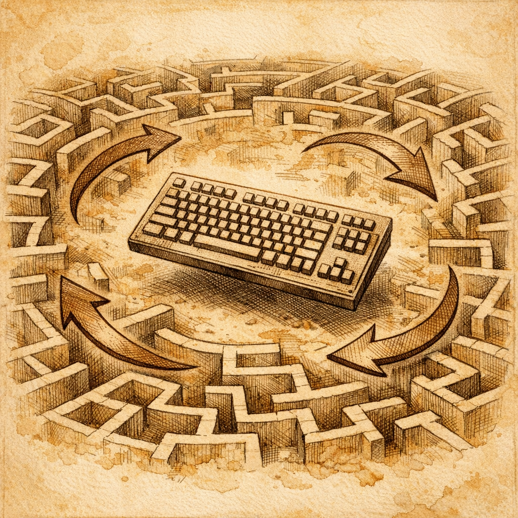
Your website is basically walking around with its fly open and nobody has the heart to tell you. Specifically, your keyboard users are stuck in a digital escape room they didn't sign up for, frantically mashing Tab like it owes them money, while your focus styles are playing an elaborate game of hide-and-seek.
Let's talk about the accessibility crisis nobody's talking about at your company meetings - the one that affects millions of people who navigate the web without a mouse. Research from the WebAIM organization found that around 1 in 4 adults in developed countries has some form of disability. A significant chunk of those people rely on keyboard navigation. And if your website traps them? Well, congratulations - you've just created a digital Dead Bolt that only affects the people who can't just grab a mouse and click their way out.
Missing Focus Styles: The Invisible User Experience
Here's a crime that happens approximately 47 times per second on the internet: a developer removes the default focus outline because it looked "ugly" and never adds anything to replace it. It's the web development equivalent of removing the exit signs from a building because they clashed with your interior design.
Focus styles are the visual breadcrumbs that tell keyboard users where they are on your page. Without them, users are essentially navigating in the dark, pressing Tab repeatedly and hoping to god something happens. You know that feeling when you're in a dark room and you're not sure if you've moved at all? Yeah. That's your keyboard users right now.
The fix is stupid simple, which makes it even more embarrassing when it's missing:
- Don't remove the default outline - unless you're replacing it with something equally visible
- Make focus styles obvious - contrast ratio of at least 3:1 against the background
- Use :focus-visible - it's basically the Goldilocks solution that shows focus only when it matters (keyboard navigation) and hides it for mouse users
- Test it yourself - seriously, just press Tab through your own site right now. If you can't see where you are, neither can your users
Keyboard Traps in Modals: A Digital Prison Nobody Escaped From
You know what's worse than a missing focus indicator? A focus indicator that leads absolutely nowhere because the user is trapped inside a modal dialog like it's a digital panic room with no emergency exit.
A keyboard trap happens when a user navigates to an element and literally cannot navigate away from it using only the keyboard. They press Tab, Tab, Tab, and they're just cycling through the same three buttons forever, like some kind of Sisyphean fever dream. It's the web development equivalent of a revolving door that only goes in one direction and doesn't actually connect to anything.
Modals are the worst offenders because they're often built to be "isolated" from the rest of the page - but that isolation shouldn't mean imprisoning your keyboard users. Here's what actually needs to happen:
- When a modal opens, focus should move into it (preferably to the first interactive element)
- Tab cycling should stay INSIDE the modal - don't let people escape into the background page
- When the modal closes (via button or Escape key), focus should return to wherever they came from
- The Escape key should actually close the modal - it's basically the universal "get me out of here" signal
Pro tip: If you're building modals and you're not testing them with only a keyboard, you're not testing them. Period.
Broken Tab Order: The Plot Twist Nobody Wanted
Tab order should be straightforward - left to right, top to bottom, logical and predictable. Instead, on many websites, it's basically a Choose Your Own Adventure novel where all the paths lead to confusion.
Broken tab order usually happens because someone used CSS to rearrange visual elements without touching the underlying HTML. Congratulations, your buttons look organized on the screen, but when you actually tab through them, you're jumping around like you're playing 4D chess with the alphabet.
The solution? Keep your tab order in the DOM (the actual HTML structure). If you absolutely must rearrange things visually, use CSS Grid or Flexbox - they handle order without breaking keyboard navigation. And use tabindex sparingly, like it's hot sauce - a little bit adds flavor, but too much burns everything down.
So What Do You Actually Do About This?
First, go test your own website right now. Close your trackpad. Unplug your mouse. Just use Tab, Shift+Tab, Enter, and arrow keys. See how far you get. I'll wait.
Still here? Good sign or terrifying sign - could go either way. If you made it through without swearing, you're ahead of most websites. If you got stuck, welcome to the club - it's huge and disappointingly exclusive to people who should definitely know better.
Run a quick accessibility audit. Use tools to check for missing focus styles and keyboard navigation issues. Involve actual keyboard users in testing if you can - they'll find problems you'd never discover otherwise. Most importantly, stop treating accessibility like a "nice to have" feature and start treating it like the fundamental part of web development it actually is.
Your keyboard users aren't asking for much. They just want to use your website without feeling like they're trapped in an escape room designed by someone who's never heard of keyboard navigation. That's not a feature request - that's a basic human expectation.
Disclaimer: This article is for informational purposes only and does not constitute legal, professional, or compliance advice. SCOUTb2 is an automated scanning tool that helps identify common issues but does not guarantee full compliance with any standard or regulation.
Stop finding issues manually
SCOUTb2 scans your entire site for accessibility, performance, and SEO problems automatically.