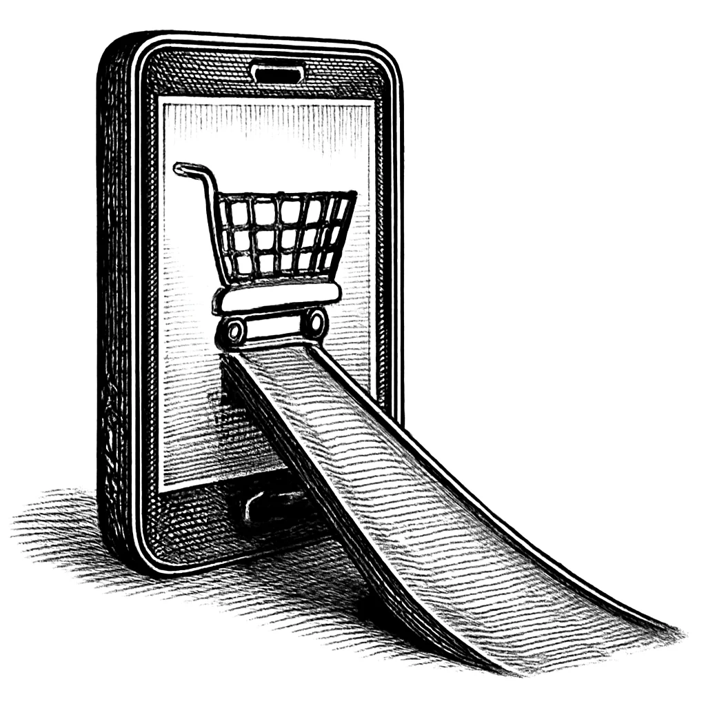
Accessible Checkout, Double Conversions
By The bee2.io Engineering Team at bee2.io LLC
I want to tell you about a checkout redesign that started with a specific goal: make the mobile checkout experience work for users with disabilities. WCAG compliance. Proper focus management. Touch targets that didn't require surgical precision to hit. Forms that worked with assistive technology. The brief was accessibility-focused from the start.
What happened next is the part that I think more product teams need to hear about.
The Redesign
The team approached the checkout with WCAG 2.1 AA as the bar to hit. This meant thinking about the experience differently than a typical conversion rate optimization project. Instead of "how do we nudge people toward completing purchase," the question became "what is actually preventing people from completing purchase, and how do we get out of their way?"
That reframe changes what you look at. Focus indicators become important because a user navigating by keyboard needs to know where they are. Error messages need to be specific and associated with the right fields because a screen reader user can't glance at the form and visually locate what's wrong. Touch targets need to be large enough that someone with limited fine motor control can reliably hit them. Input fields need proper labels so autofill works correctly.
None of these things are aesthetically complicated. They are mostly the work of doing the obvious thing rather than the shortcut.
The Results
According to the published case study, after the redesign shipped:
- Conversion rate among users with accessibility needs: reported to have more than doubled
- User errors at checkout: reported down 40% across all users
- Annual revenue increase: reported at approximately 10x the project cost
The reported 40% reduction in user errors is the one I want to focus on, because it makes the most important point about accessibility work.
The "All Users" Effect
That reported 40% error reduction was not just among users with disabilities. It was across all users. Everyone who went through the checkout made fewer mistakes after the redesign than before it.
This is the thing about accessibility improvements that gets lost in the "it's the right thing to do" framing. Accessibility and usability are not separate concerns. When you write a clear, specific error message associated with the correct form field (because that's what WCAG requires for assistive technology users), every user benefits from that clear error message. When you make touch targets large enough to hit reliably (because that's what WCAG requires for users with motor impairments), everyone's fat-fingered taps on their phone become more accurate.
The checkout that works well for a blind user using a screen reader is almost always a checkout that works better for a sighted user on a phone who's juggling it one-handed on a commute. The problems are related. The fixes are the same fix.
What the 10x Return Actually Represents
The reported 10x return on project cost sounds like a big number, and it is, but I think it undersells the compounding nature of what happened here. This wasn't a marketing campaign that ran for a quarter and then ended. The checkout redesign shipped once and continues to improve conversion rates every day. The annual revenue figure represents ongoing, durable improvement from a one-time investment in getting the foundation right.
This is different from most conversion rate optimization work, which tends to produce marginal, diminishing returns from increasingly small tweaks. Fixing accessibility barriers often produces step-change improvements because you're removing blockers, not micro-optimizing an already functional flow. You're going from "this checkout actively doesn't work for a percentage of your users" to "this checkout works." That's a categorical improvement, and the revenue impact reflects that.
Finding Your Checkout Barriers
The barriers that were present in the pre-redesign checkout are the same barriers that exist in a large percentage of mobile checkout flows right now. Missing form labels. Touch targets that are 24x24px instead of 44x44px. Error messages that appear at the top of the form rather than inline with the field that caused them. Focus that jumps unpredictably when a modal opens. These are not exotic edge cases.
If you haven't audited your checkout for WCAG compliance, you don't know what you're leaving on the table. And because accessibility problems hurt all users (not just disabled users), the potential upside from fixing them is larger than most teams assume.
SCOUTb2 checks for common WCAG violations that frequently appear in checkout flows: form labels, color contrast, keyboard navigability, touch target sizing, and focus management. Run a scan on your checkout pages to identify potential issues. Fixing accessibility barriers may help improve the experience for all users, even if they never know why things suddenly feel easier.
Disclaimer: This article is for informational purposes only and does not constitute legal, professional, or compliance advice. SCOUTb2 is an automated scanning tool that helps identify common issues but does not guarantee full compliance with any standard or regulation.
Stop finding issues manually
SCOUTb2 scans your entire site for accessibility, performance, and SEO problems automatically.